The Question
How can we recommend movies based on similarity?
Exploratory Data Analysis
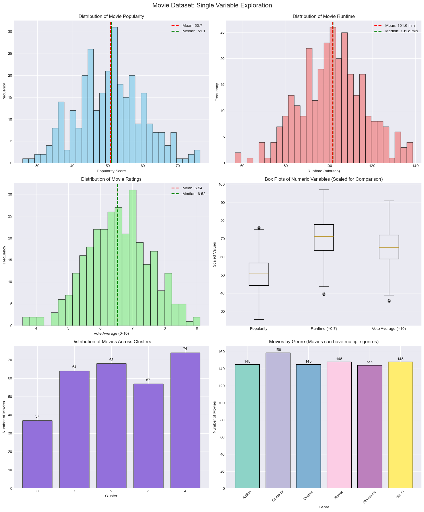 These plots showcase our exploratory data analysis (EDA) to understand the structure and distribution of the movie dataset before building a recommendation system. The univariate distributions in the top row such as histograms of popularity, runtime, and vote average, reveal roughly normal distributions with slight skewness, suggesting that most movies cluster around the mean values, but outliers exist. Key summary statistics like the mean and median are overlaid to indicate central tendency, helping us assess skewness and symmetry. The box plot in the top right compares the spread (interquartile range) and presence of outliers across the three numeric variables, using scaled values to enable direct comparison. The bottom left bar chart displays the distribution of movies across five unsupervised clusters, likely generated using a clustering algorithm such as K-Means, showing how the dataset groups based on feature similarity. Finally, the bottom right bar plot shows a frequency count of movie genres, giving insights into categorical variable distribution and genre diversity in the dataset. These EDA techniques — including data visualization, summary statistics, and pattern identification — provide crucial context for understanding variable relationships and preparing the data for similarity-based recommendations.
Dimension reduction
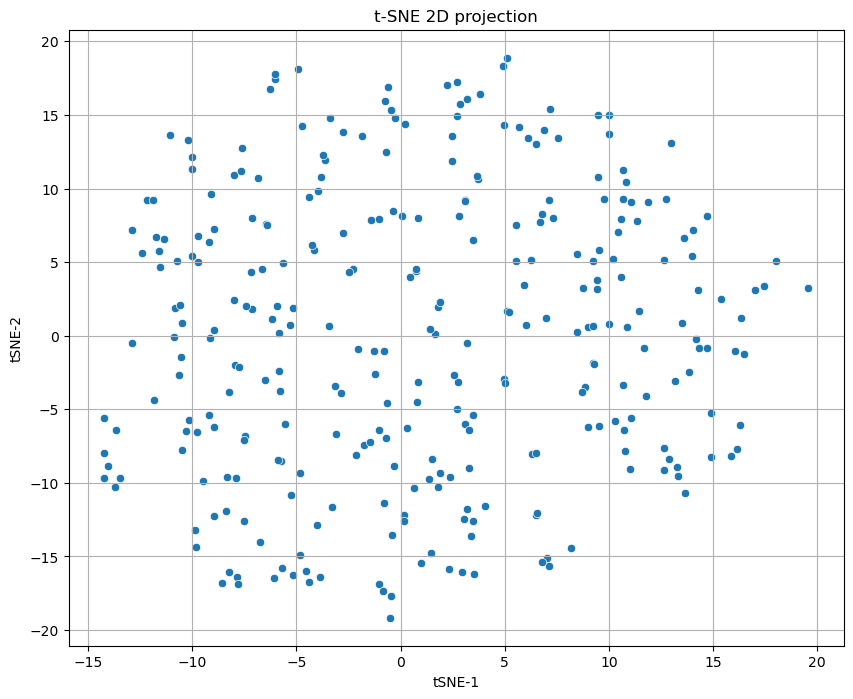 This scatter plot shows the result of t-SNE, a nonlinear dimension reduction technique used to project high-dimensional data into two dimensions for easier visualization. In this case, we intentionally dropped the original “cluster” labels to allow t-SNE to form its own structure without prior knowledge of existing groupings. As a result, the graph appears less clearly clustered compared to groups that included cluster labels during projection. This approach helps reveal natural structure and similarity in the data based purely on feature relationships, though the absence of cluster supervision may lead to a more diffuse, spread-out visualization.
Clustering
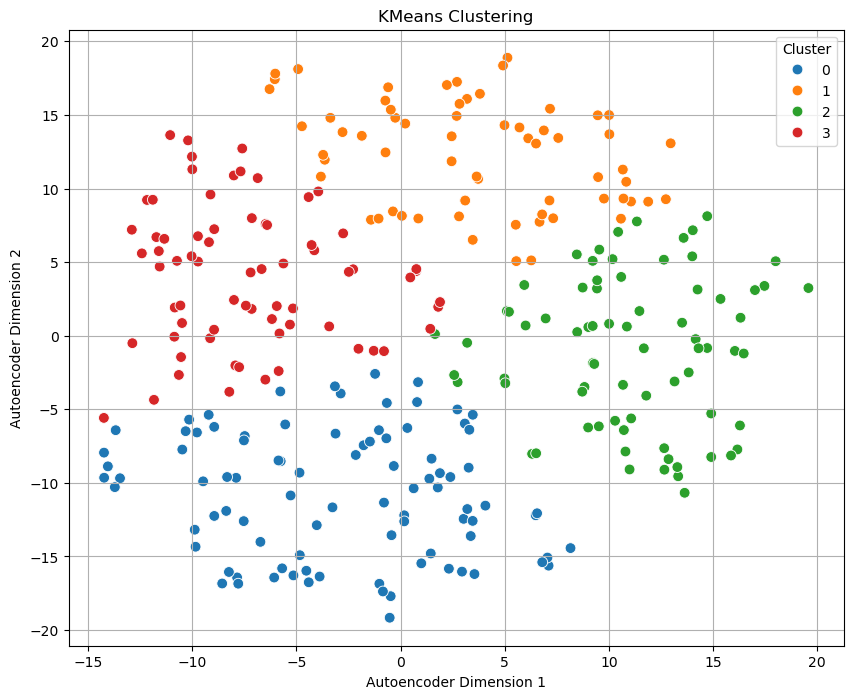 This plot visualizes the results of applying K-Means clustering on a 2D representation of the data generated using an autoencoder, a type of neural network used for unsupervised dimensionality reduction. The axes represent the compressed features learned by the autoencoder (Dimension 1 and Dimension 2), and each point represents a data sample. The colors correspond to the four clusters (0 to 3) identified by the K-Means algorithm.
Unlike t-SNE, which is more focused on preserving local structure, autoencoders try to learn a compressed representation that retains essential features of the input data. K-Means then partitions the embedded space into well-separated clusters, as seen here with clear groupings and minimal overlap. This visualization demonstrates that the autoencoder captured enough meaningful structure to allow K-Means to distinguish natural groupings in the dataset effectively.
Cluster interpretation
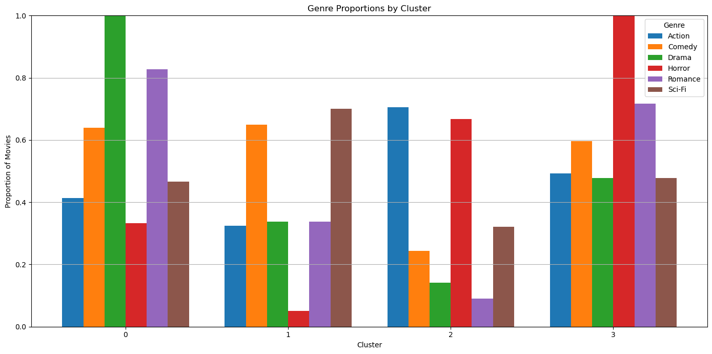
- Cluster 1 is drama and romance movies
- Cluster 2 is lighthearted comedy and sci fi movies
- Cluster 3 is dramatic action movies
- Cluster 4 is horror movies